From September 2016, Longbenton Community College will be re-named Longbenton High School, as students and staff move in to the new building. Alongside this, the school are adopting a crisp, modern new logo and uniform.
As the new school year is edging closer we wanted to find out what the new uniform looked like and what people thought about the new logo.
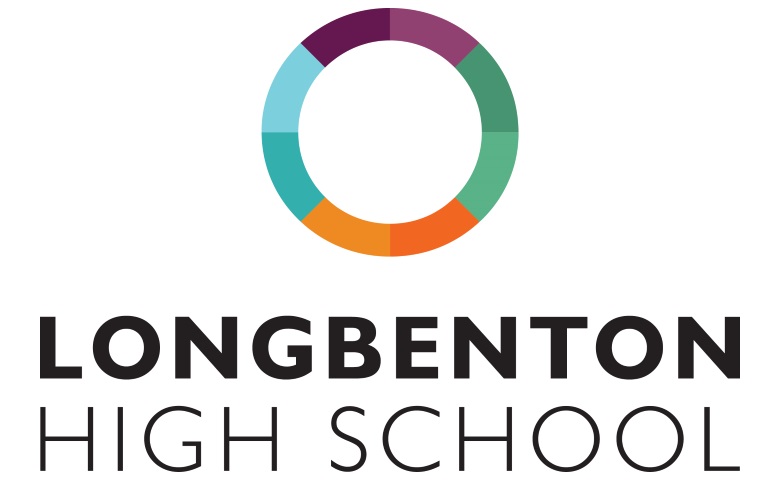
Miss Calendar, who was instrumental in overseeing the bright, bold colours of the new design, told us, “The logo was designed by a company called JUMP to tie in with the move to a new build and the change of name to Longbenton High School. The circle reflects the inclusive nature of the school; each of the different colours represents an area of the school and that whilst all of the areas of the school have different identities we all form part of the same team.”
The students are very positive about this bright, new design. One student said, “Seeing as we are moving into a fresh school I think it makes sense to make the school’s uniform and badge more modern and fresh. The red and black logo has been in since my mam was at this school and that was 21 years ago in 1995. That is a long time.”
Personally, I like the idea of changing the blazer design as I think it makes us stand out more, with a design that is different to other schools. English teacher, Mrs Robinson also feels the badge is a reflection of what the school represents, saying “I like the idea that the colours in the badge represent the different departments around the school and it looks very bright and modern, just like the new building itself. The circle is a strong symbol of how students and staff at Longbenton work together as a team.”